Progresión del Ciclo Solar
Los gráficos de esta página muestran la evolución del ciclo solar. Los gráficos se actualizan cada mes por el SWPC con las últimas predicciones ISES. Los valores observados son inicialmente valores temporales que se reemplazan con los datos finales una vez que estén disponibles. Todos los gráficos en esta página se pueden exportar como archivos JPG, PNG, PDF o SVG. Cada conjunto de datos se puede activar o desactivar haciendo clic en la descripción correspondiente debajo de cada gráfico.
Número de erupciones solares de clase C, M y X por año
El siguiente gráfico nos muestra el número de erupciones solares de clase C, M y X que se producen durante un año determinado. Esto nos da una buena idea de la cantidad de erupciones solares en relación con el número de manchas solares. Es otra forma de ver cómo evolucionó con el tiempo un ciclo solar. Estos datos vienen de NOAA SWPC y se actualizan diariamente.
El siguiente gráfico muestra el número de erupciones solares de clase C, M y X que se produjeron durante el mes pasado, junto con el número de manchas solares de cada día. Esto le da una idea de la actividad solar durante el mes pasado. Estos datos vienen de NOAA SWPC y se actualizan diariamente.
The Butterfly Diagram
Throughout the solar cycle, the latitude of sunspot regions varies with an interesting pattern. The graph below shows the latitude of all sunspot regions of the last 22 years versus the time (in years). Sunspots are typically confined between -35° south and +35 degrees north latitude. At the beginning of a new solar cycle, sunspot regions are formed at a higher latitudes, but as the cycle progresses towards the maximum, the sunspot regions gradually form at lower latitudes. When nearing the solar minimum, the sunspot regions appear around the solar equator and as a new cycle starts again, sunspots of the new cycle will start to emerge at a high latitude. This recurrent behaviour of sunspots give rise to the 'Butterfly' pattern and was first discovered by Edward Maunder in 1904. The graph is updated every month.
Número de días impecables por año
Durante los períodos de baja actividad solar, el Sol puede estar desprovisto de manchas solares y por lo tanto estar impecable. Esto es una ocurrencia frecuente en los años alrededor y durante el mínimo solar. El siguiente gráfico muestra cuántos días durante un año determinado, el lado que mira hacia la tierra del Sol no tenía manchas solares.
Número de días con una tormenta geomagnética por año
El siguiente gráfico muestra el número de días con una tormenta geomagnética por año y la fuerza de esas tormentas. Esto le dará una idea en que años hubo una gran cantidad de tormentas geomagnéticas.
Últimas noticias
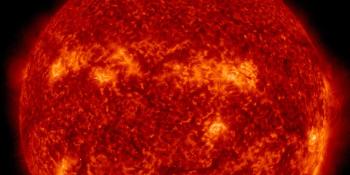
G3 geomagnetic storm watch for 4 and 5 June
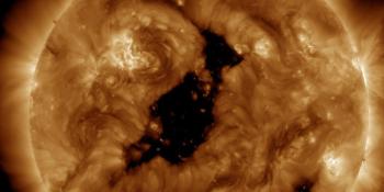
Coronal hole faces Earth
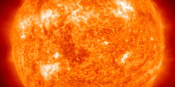
X1.5 solar flare
Últimos mensajes del foro
Apoye a SpaceWeatherLive.com!
A lot of people come to SpaceWeatherLive to follow the Solar activity or if there is a chance to see the aurora, but with more traffic comes higher costs to keep the servers online. If you like SpaceWeatherLive and want to support the project you can choose a subscription for an ad-free site or consider a donation. With your help we can keep SpaceWeatherLive online!


Hechos clima espacial
| Último evento clase X | 03/06/2026 | X1.0 |
| Último evento clase M | 21/06/2026 | M6.9 |
| Últimas tormentas geomagnéticas | 11/06/2026 | Kp5 (G1) |
| Días sin manchas | |
|---|---|
| Last 365 days | 3 días |
| 2026 | 3 días (2%) |
| Último día sin manchas | 24/02/2026 |
| Promedio de manchas solares mensuales | |
|---|---|
| mayo 2026 | 101.4 +22.1 |
| junio 2026 | 98.3 -3.1 |
| Last 30 days | 108.1 +9.3 |